Art Out West

Map of the open studios art trail
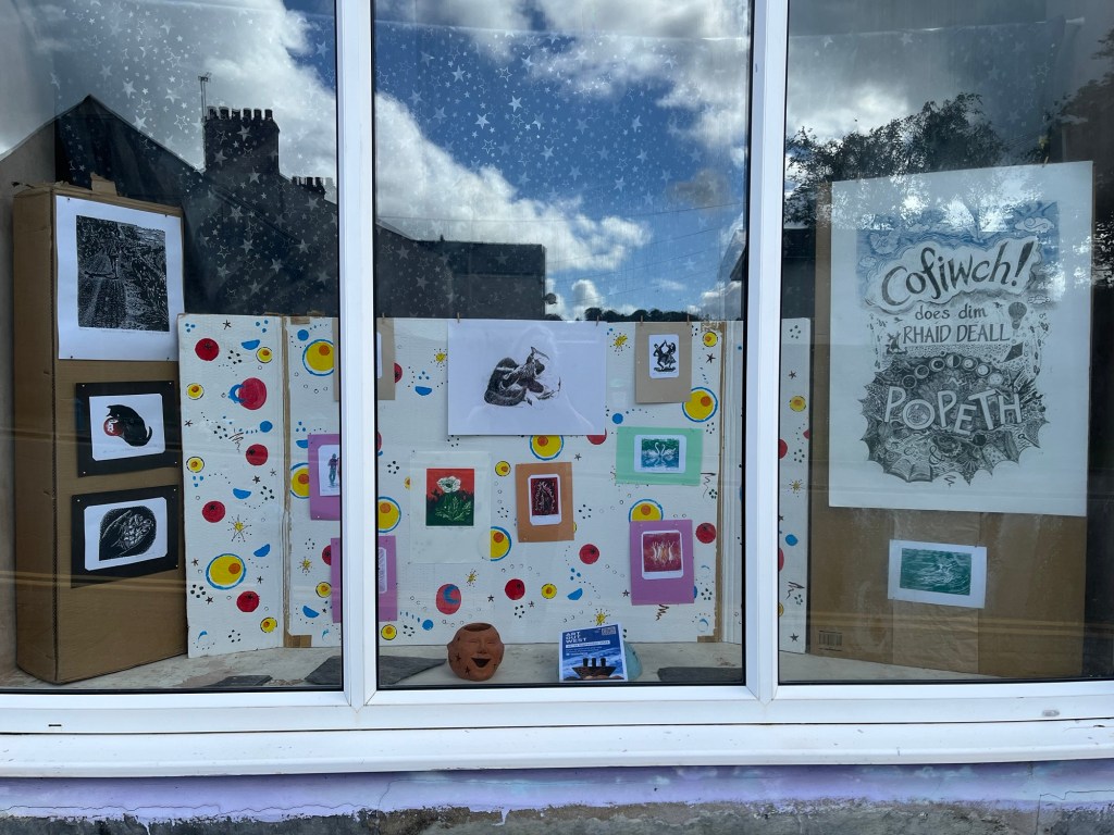
Small linocuts in a window display

I enjoyed making the background wallpaper for this window display. It’s inspired by a house move when I was about three years old. The new house’s wallpaper was all atomic design; my bedroom had pink and yellow ovals on a grey background. The kitchen was red, yellow and black. That was the first room to be redecorated with pale blues etc, but I preferred the original patterns.

My studio is whichever space is available at the moment, not particularly welcoming for any visitors. Pondering how to put a window exhibition together made me a bit nostalgic for previous studios. The lingering scent of dead pigeons in the roof; tin baths catching the raindrops falling from above. Sharing printing presses with people who left fingerprints on everything(!) There was a lot of admin to help out with in a studio building, the office area was usually warmer so it would be a haven of bustling activity.

There’s also the notion of being a local artist. That’s quite a difficult term, often used as an insult. I’ve lived here for 25 years but I’m not really local. A Radio 4 programme about blood types informed me that I’m part of the same group as some historic invaders. This area is known as ‘The Little England Beyond Wales’, even though the incomers seemed to be Flemish. I’ve never heard any Belgian people chatting around here (so far).

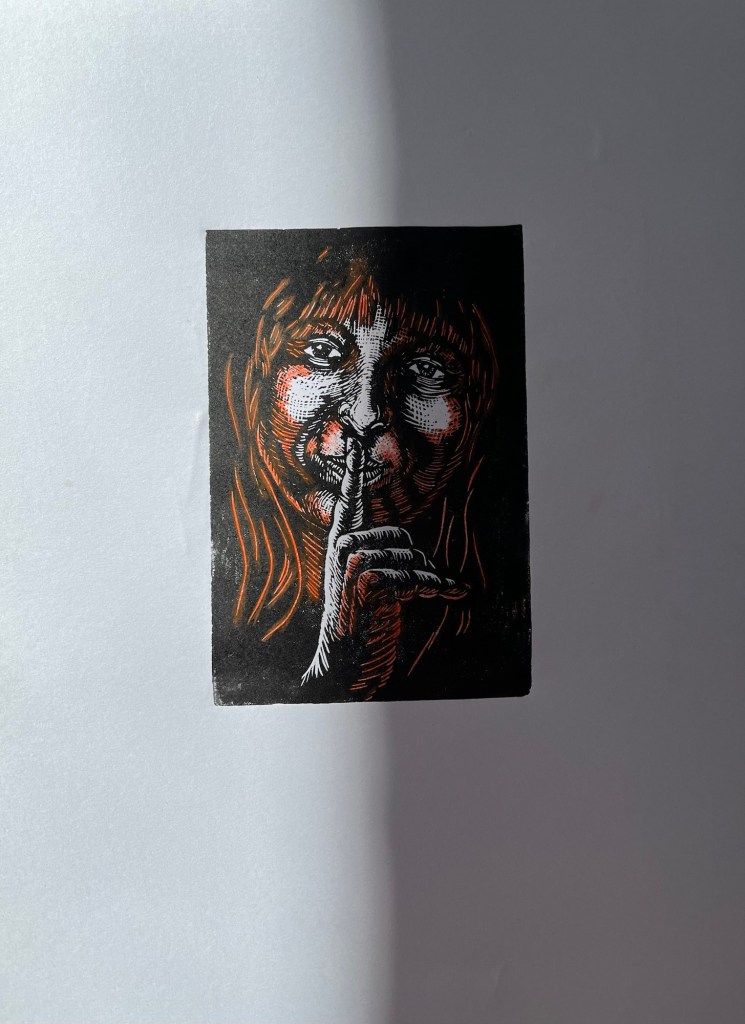
Anyway, these prints gathered together made me realise how many feature hands. Someone asked me if I could draw hands, so I drew a few. Then they asked “but what are linocuts used for?”, so the wallpaper design was to make that clear. What next? I might attempt to put my novel into the right order. It’s about an artist moving to Wales, even though their friends say that’s the same as being dead…
White Poppy

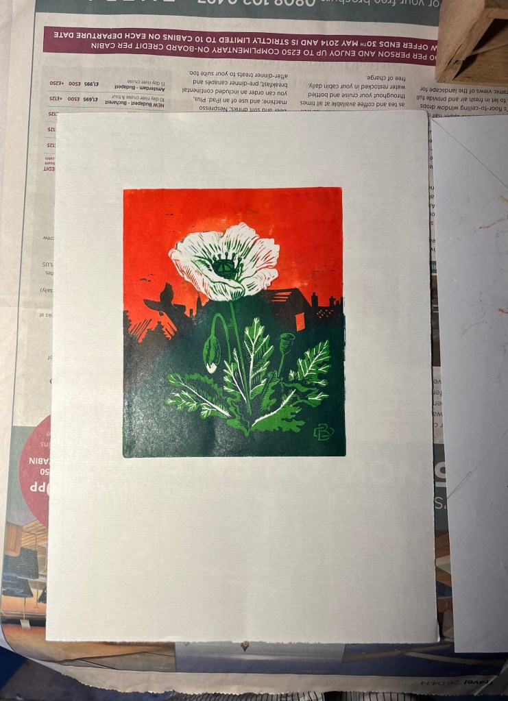
Linocut of a white poppy
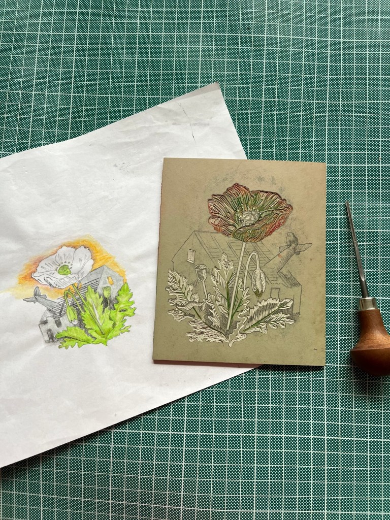
Lino block with sketch

When this lino block was first cut, a long time ago, it was going to be printed in pale subtle colours. Something on the news the other day while choosing inks made me reach for scarlet and emerald green instead.

The block is similar to an unfinished print from even longer ago. As a teenager I liked the idea of nature reclaiming damaged land. Maybe it’s still a nice idea. The white poppy has symbolised pacifism for nearly a century. Weapons are presumably more profitable but mediation and peaceful resolution has a preferable outcome.

Shadows

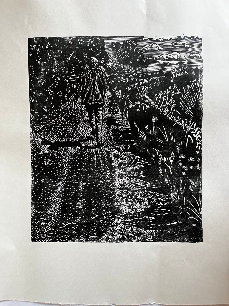
Jack the dog walking through the hedgerow

I was watching Jack’s shadow walking in a meadow when the rest of us were all over the pavement. It took a while to get some photos, passing traffic kept hiding the subject.

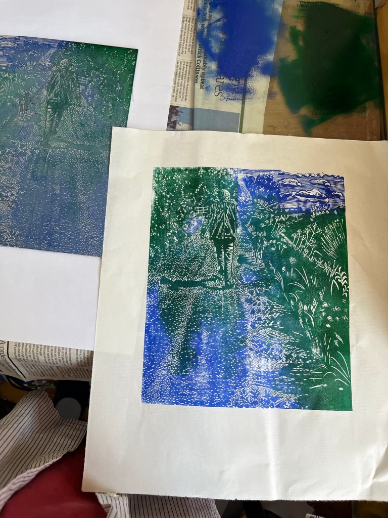
Walking on water?

Making test prints on the hottest day of the year isn’t a good idea. I wanted to know if the little dots looked like a road surface, so I began inking quite early. This hasn’t captured the idea I saw while walking, but it’s OK.

Nineteen Eighty Four

I’ve realised it’s now forty years since my art college graduation. There’s a certificate somewhere on the bookshelf that says I have a degree in Fine Art. The certificate doesn’t look like a genuine document so it fits well with my dissertation about art forgery.

“But what is Fine Art?” people ask. No idea, but it’s a term used in frilly lettering outside galleries showing the kind of art that would have been sneered at by any of our tutors. In 1984, anything looking like a craft was discouraged. Printmaking was a grey area, but it was tolerated.

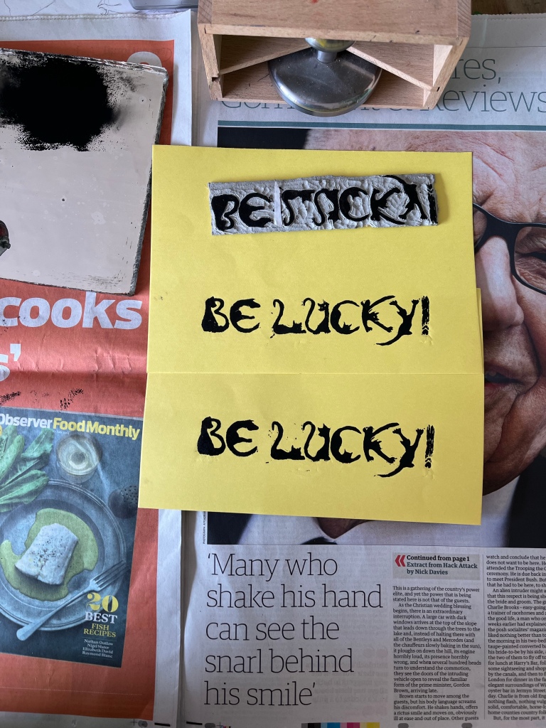
Fine Art printed with linseed ink on paper

For the first few years after graduation I was a member of some printmaking studios. There were group exhibitions and teaching sessions. Then there were the ‘back to work’ schemes. These assumed that all work took place in an office, so there were basic maths and literacy classes. Meanwhile, I missed deadlines for creative opportunities which required proof of concept and skills. Helpful jobcentre ladies would ring prospective employers, saying “She’s got a degree in graphic design!”. When I pointed at my CV (again), they’d say “isn’t that the same thing?”.

During the last four decades I’ve collected a lot of rejection letters. Some of them were quite expensive.

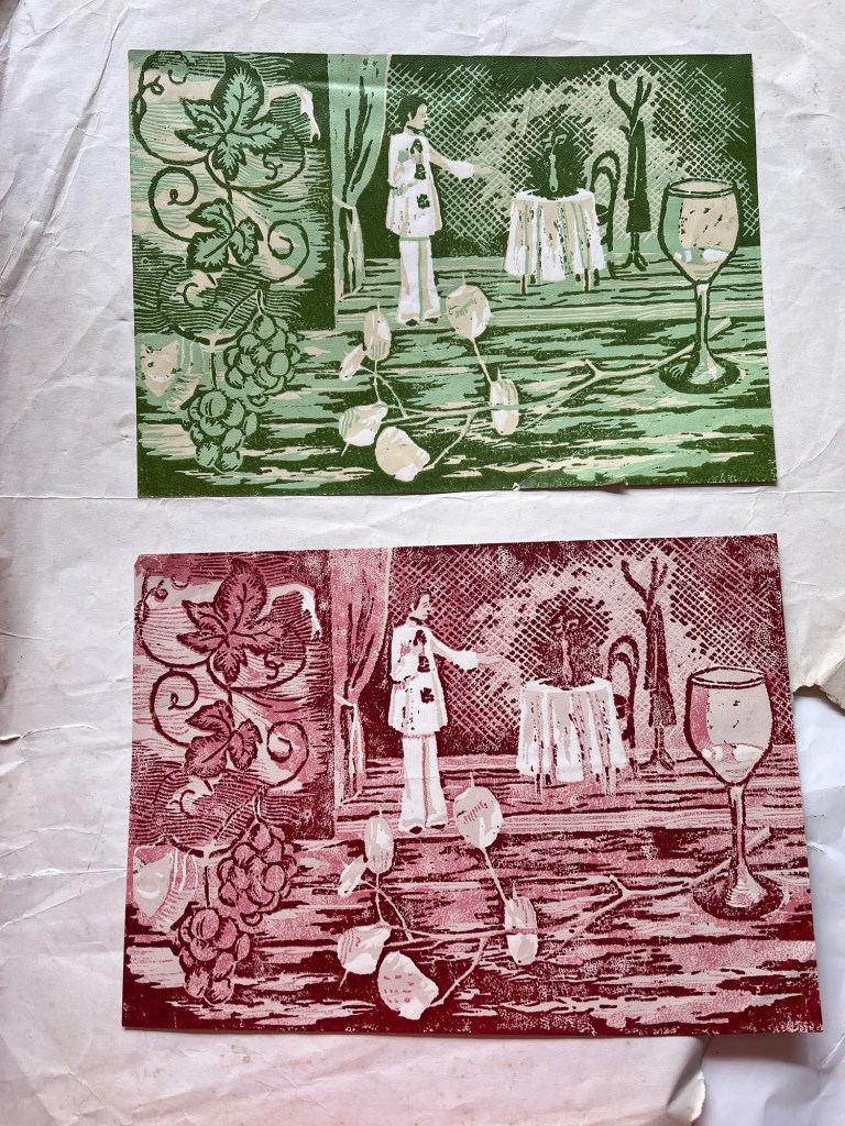
A level exam piece

Two lino prints, each has three layers of pinks or greens. The image has a pierrot on stage with a dining table, framed by a grape vine and some honesty next to a wine glass.

I found this exam piece from 1980. Was there a specific theme on the exam paper? There were discussions with art teachers about what ‘advanced’ level really meant. One art teacher assumed I was being critical of his teaching style, or another person’s work. I wanted to know the difference between ‘ordinary’ and ‘advanced’ level printmaking. One of the art teachers was keen on outlines, which is why the wine glass has a dark line around it rather than having a darker table (or floor?) next to its lighter side.

There’s too much cutting here to have fitted into the 15 hours allowed for the exam, so it deserved the D grade. “It’s the time factor, y’see?” was often said to us in passing. It would have taken less time without all the cross hatching. I wasn’t pleased with the composition but felt too overwhelmed by the whole process to think about using a better sketch at the time.

A few years later the art college principal’s secretary queried my Art & Craft A level. It was allegedly unsuitable for a Fine Art establishment, but hadn’t been mentioned until I had been studying there for a year. That sent me back to the midst of this linocut, feeling inadequate and unable to speak clearly about my creative abilities.

Test prints

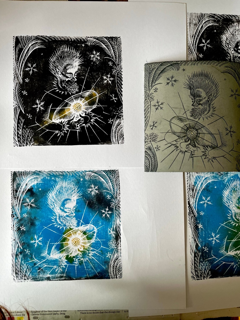
Jack Frost monoprints
Linocut of seven black cats

A couple of printing sessions that were more chaotic than usual. Missing pliers meant that I couldn’t get the lid off a blue ink tube. Some leftover black from the previous day seemed a good option. Later, I found another foil-wrapped leftover, a mixture of blue and white.

If Jack Frost has trapped the sun in a block of ice, then that would be the only light source. My first plan was to have a cool grey bluish sky with a bright yellow sun shining through the ice. Now I like the black background better. It still needs some tweaking…

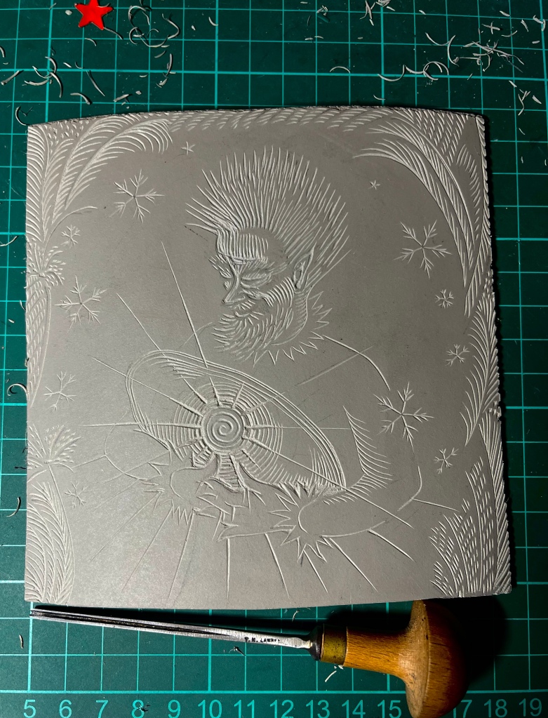
Jack Frost

Sun trapped in ice

Made a start on a linocut, Jack Frost with the sun trapped in a block of ice. Or is it? Anyway, the repetitive action of cutting small lines isn’t good for the shoulder wound so I’m staying away from the lino today.

Cups, plates and bowls

Tidying some space around the house. The last chimney improvements added a fine layer of dust to this dinner set that has been sitting around for years. Might inspire some still life drawings, or some pasta sauces that will be good in the wider bowls in the corner.

Green Fuse

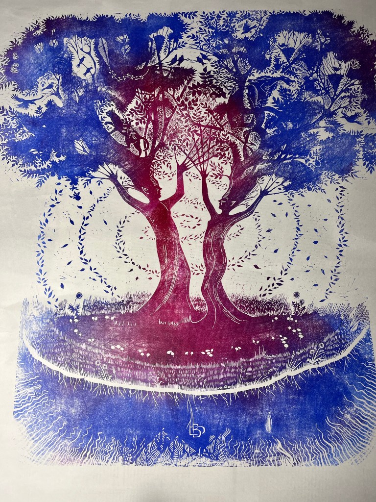
Linocut test print. Two human shaped trees with a spiral of leaves.

There’s often an imaginary gallery in my dream landscape. Various prints and drawings appear on the walls, some of which I recycled years ago. A few months ago, this woodland scene was on display. I didn’t like it but it kept getting in the way of my dreaming walk around the gallery. Maybe if I make a version in the real world it’ll disappear from my dreams? Cutting the lino took a long time. A drawing would’ve been much more direct but it wouldn’t have looked right.

I’m very fond of folk tales and legends. The thought of making pictures of tree spirits didn’t appeal, there are enough around already. I suppose this is a depiction of the life force of the planet we live on. We don’t think about our connectivity until it’s under threat.

The theory of bad workmen blaming their tools comes in again. Blunt cutting tools won’t cut fine lines exactly where you plan them to be. Badly made rollers/brayers won’t pick up ink smoothly. I thought I’d use a second roller to add blue to the upper corners of the tree. It didn’t pick up any ink at all…

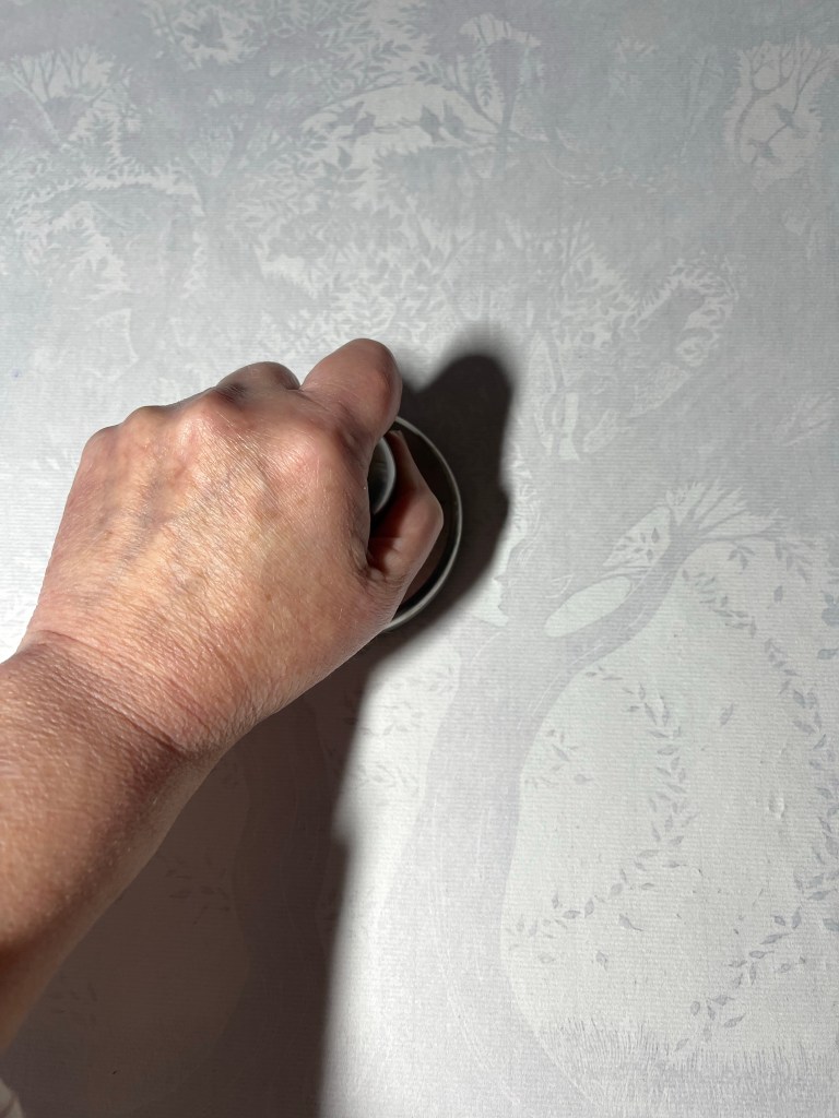
Back view of a print in progress
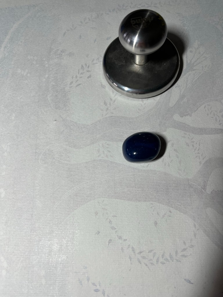
Lapis lazuli?

Sometimes a tiny detail isn’t in contact with the paper. A wooden spoon or the edge of a coin is useful to rub that section more closely. My usual beach pebble had disappeared so a piece of lapis lazuli was employed instead.