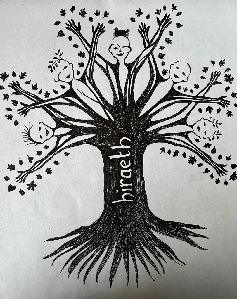
I don’t remember drawing this but it was probably for someone else. Everything in the sketchbook is from about ten or so years ago.

I don’t remember drawing this but it was probably for someone else. Everything in the sketchbook is from about ten or so years ago.

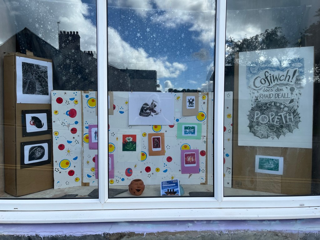
I enjoyed making the background wallpaper for this window display. It’s inspired by a house move when I was about three years old. The new house’s wallpaper was all atomic design; my bedroom had pink and yellow ovals on a grey background. The kitchen was red, yellow and black. That was the first room to be redecorated with pale blues etc, but I preferred the original patterns.
My studio is whichever space is available at the moment, not particularly welcoming for any visitors. Pondering how to put a window exhibition together made me a bit nostalgic for previous studios. The lingering scent of dead pigeons in the roof; tin baths catching the raindrops falling from above. Sharing printing presses with people who left fingerprints on everything(!) There was a lot of admin to help out with in a studio building, the office area was usually warmer so it would be a haven of bustling activity.
There’s also the notion of being a local artist. That’s quite a difficult term, often used as an insult. I’ve lived here for 25 years but I’m not really local. A Radio 4 programme about blood types informed me that I’m part of the same group as some historic invaders. This area is known as ‘The Little England Beyond Wales’, even though the incomers seemed to be Flemish. I’ve never heard any Belgian people chatting around here (so far).
Anyway, these prints gathered together made me realise how many feature hands. Someone asked me if I could draw hands, so I drew a few. Then they asked “but what are linocuts used for?”, so the wallpaper design was to make that clear. What next? I might attempt to put my novel into the right order. It’s about an artist moving to Wales, even though their friends say that’s the same as being dead…
Trying to rescue a print that had been overcut. The light gradually moved across the paper while I was colouring…
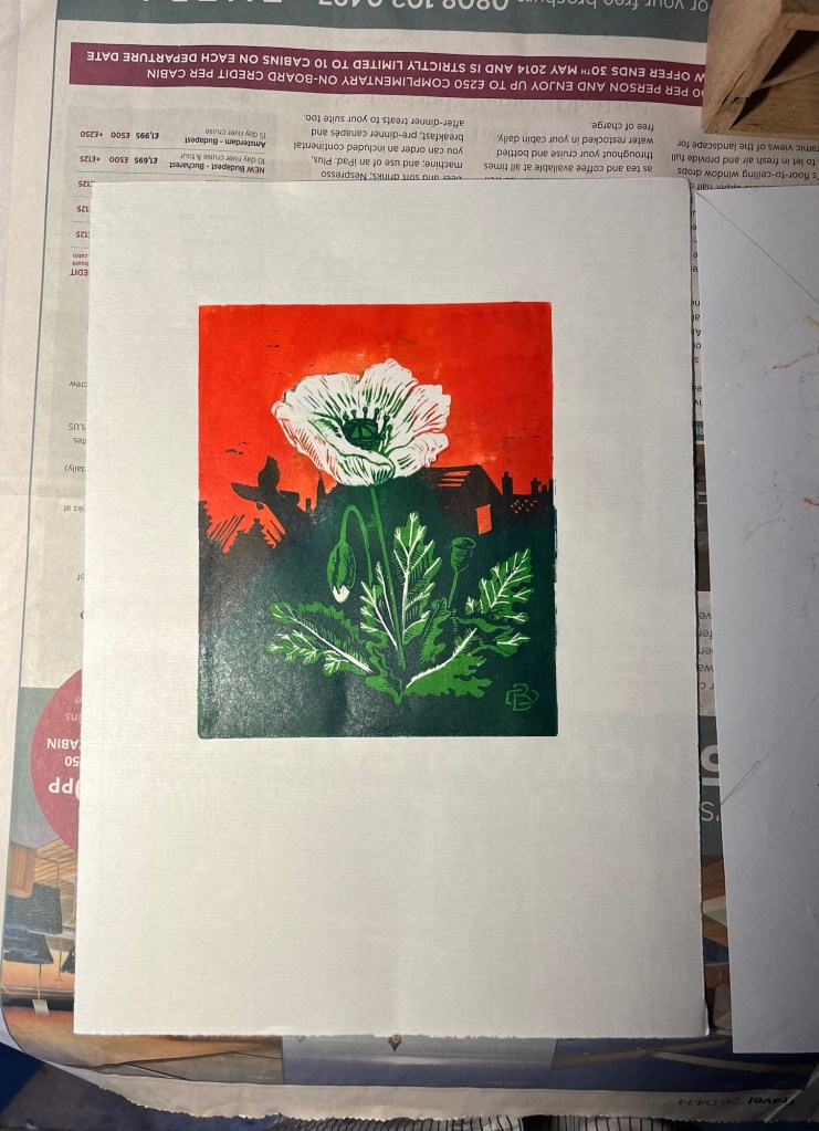
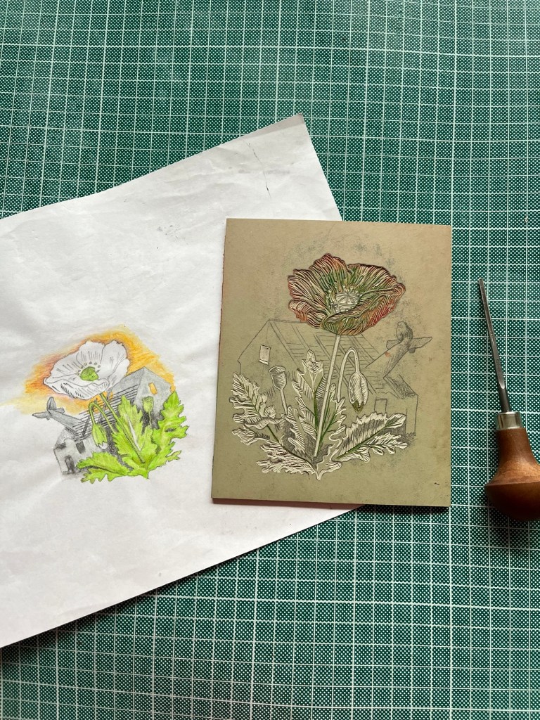
When this lino block was first cut, a long time ago, it was going to be printed in pale subtle colours. Something on the news the other day while choosing inks made me reach for scarlet and emerald green instead.
The block is similar to an unfinished print from even longer ago. As a teenager I liked the idea of nature reclaiming damaged land. Maybe it’s still a nice idea. The white poppy has symbolised pacifism for nearly a century. Weapons are presumably more profitable but mediation and peaceful resolution has a preferable outcome.
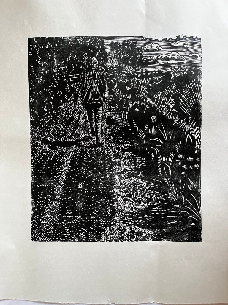
I was watching Jack’s shadow walking in a meadow when the rest of us were all over the pavement. It took a while to get some photos, passing traffic kept hiding the subject.
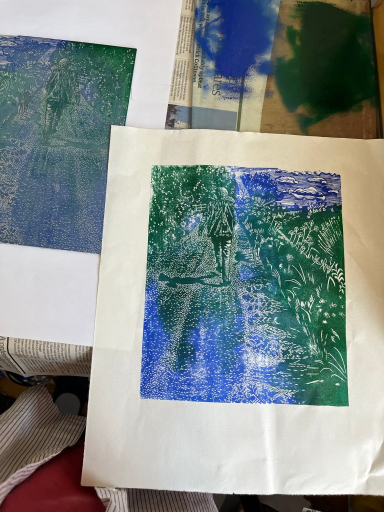
Making test prints on the hottest day of the year isn’t a good idea. I wanted to know if the little dots looked like a road surface, so I began inking quite early. This hasn’t captured the idea I saw while walking, but it’s OK.
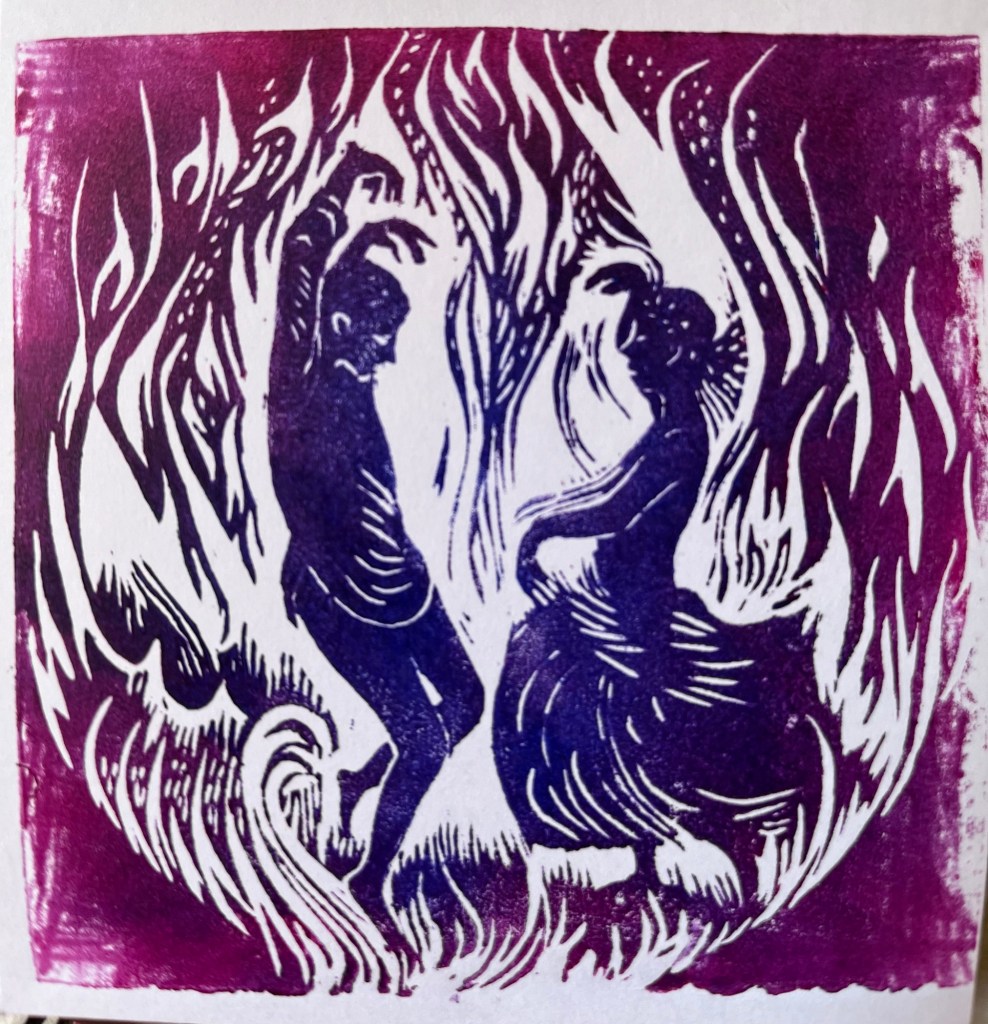
Linocut of some dancers, based on photos I took in Glastonbury. They will be printed in red and yellow for next midsummer.
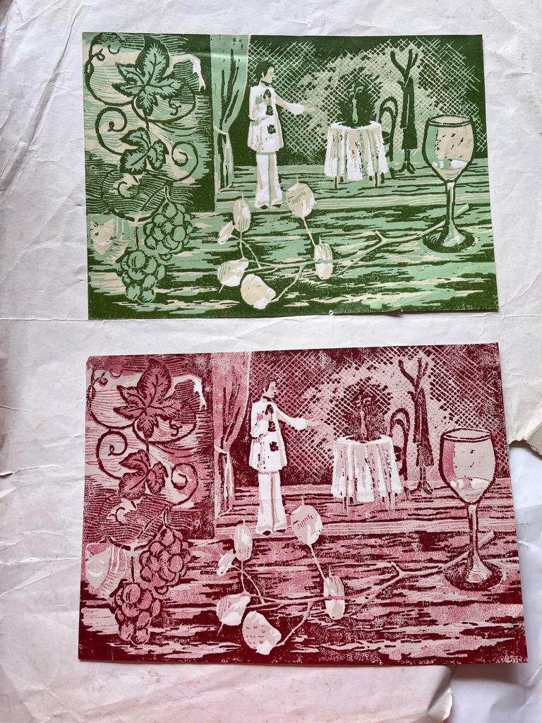
I found this exam piece from 1980. Was there a specific theme on the exam paper? There were discussions with art teachers about what ‘advanced’ level really meant. One art teacher assumed I was being critical of his teaching style, or another person’s work. I wanted to know the difference between ‘ordinary’ and ‘advanced’ level printmaking. One of the art teachers was keen on outlines, which is why the wine glass has a dark line around it rather than having a darker table (or floor?) next to its lighter side.
There’s too much cutting here to have fitted into the 15 hours allowed for the exam, so it deserved the D grade. “It’s the time factor, y’see?” was often said to us in passing. It would have taken less time without all the cross hatching. I wasn’t pleased with the composition but felt too overwhelmed by the whole process to think about using a better sketch at the time.
A few years later the art college principal’s secretary queried my Art & Craft A level. It was allegedly unsuitable for a Fine Art establishment, but hadn’t been mentioned until I had been studying there for a year. That sent me back to the midst of this linocut, feeling inadequate and unable to speak clearly about my creative abilities.

There are many tasks to do today but I knitted instead. The project will become too big for three needles so I’ve added more. They’re slightly bent from being stuck under a heavy item for too long. They still function well.


I’m glad the dead matches were there. They’re exactly the right size for getting ink out of the tube lids! The sky will be watercoloured in later.

